Formophobia
Research project
Ever found yourself at the head of a queue of annoyed people at the post office, clock ticking in your ear, frozen in front of an undecipherable, complex document form?
Well, chances are you’ve experienced a clear case of formophobia!
Formophobia is a non-official (but proven to exist) psychological disorder, which makes it extremely difficult to provide personal information on forms and documents.
Most of the time, this (surprisingly) common condition can undoubtedly be purely psychological; design, however, is a factor not to be excluded, as it can play a very important role in its determination.
A well-designed form can, as a matter of fact, silently guide form users in recognizing the document’s hierarchical structure, and therefore make its use less stressful and time-consuming.
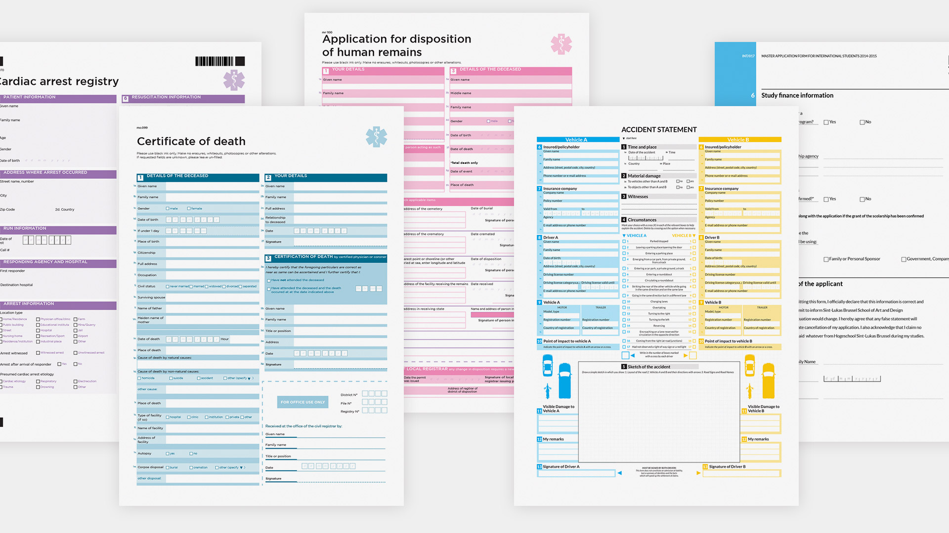
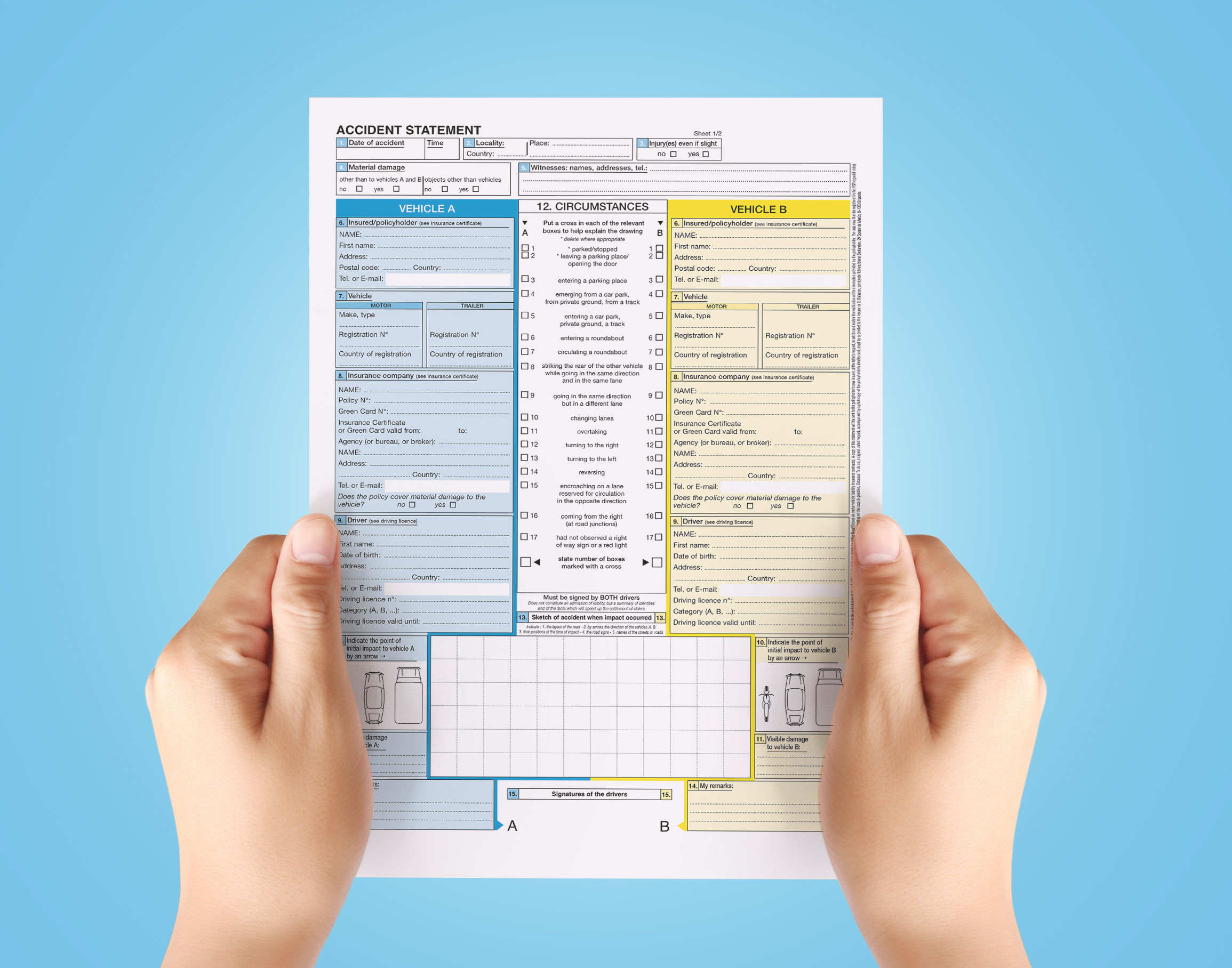
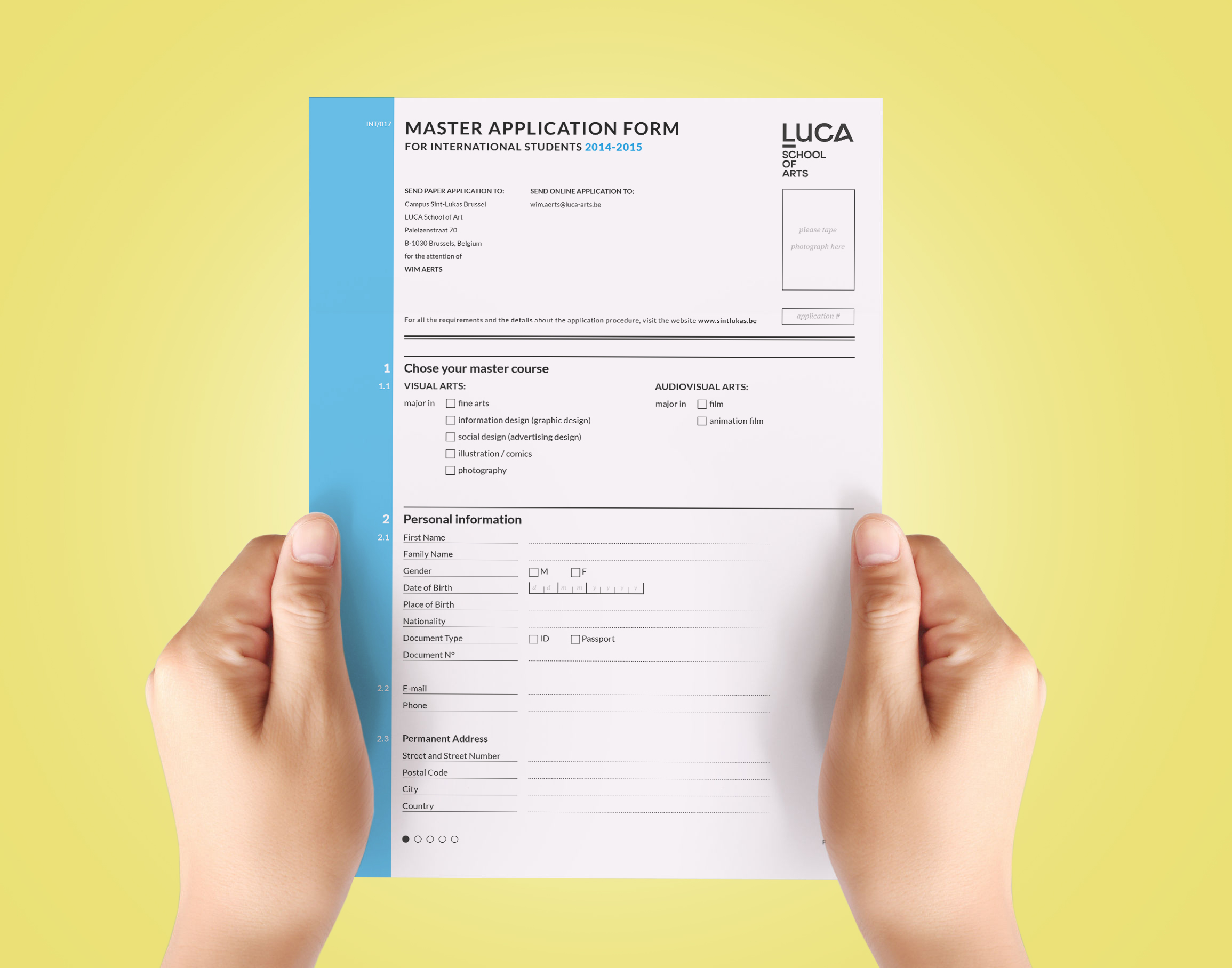
On a practical level, I decided to analyze and re-design a number of particularly nasty (both in the design and content) forms, such as the European Accident Statement Form (which you might have run into after a car accident) and a generic death certificate along with other sanitary-themed documents.
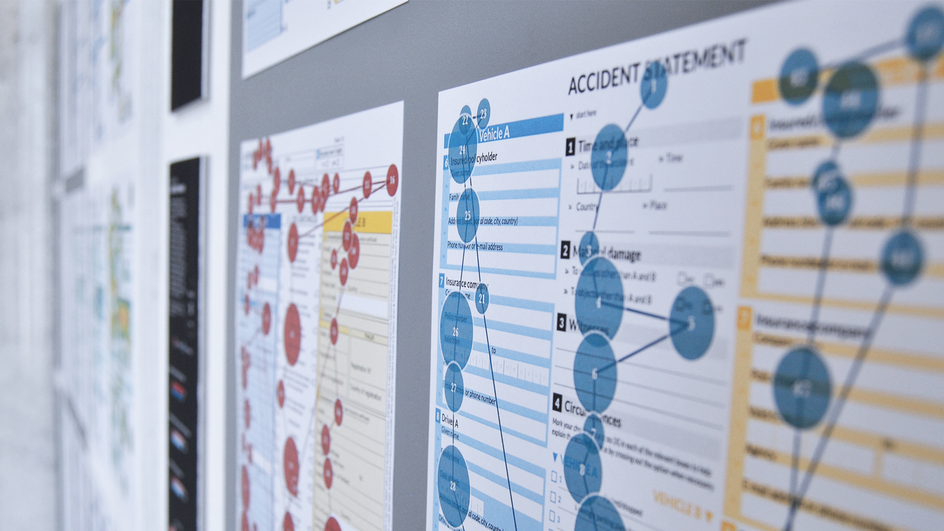
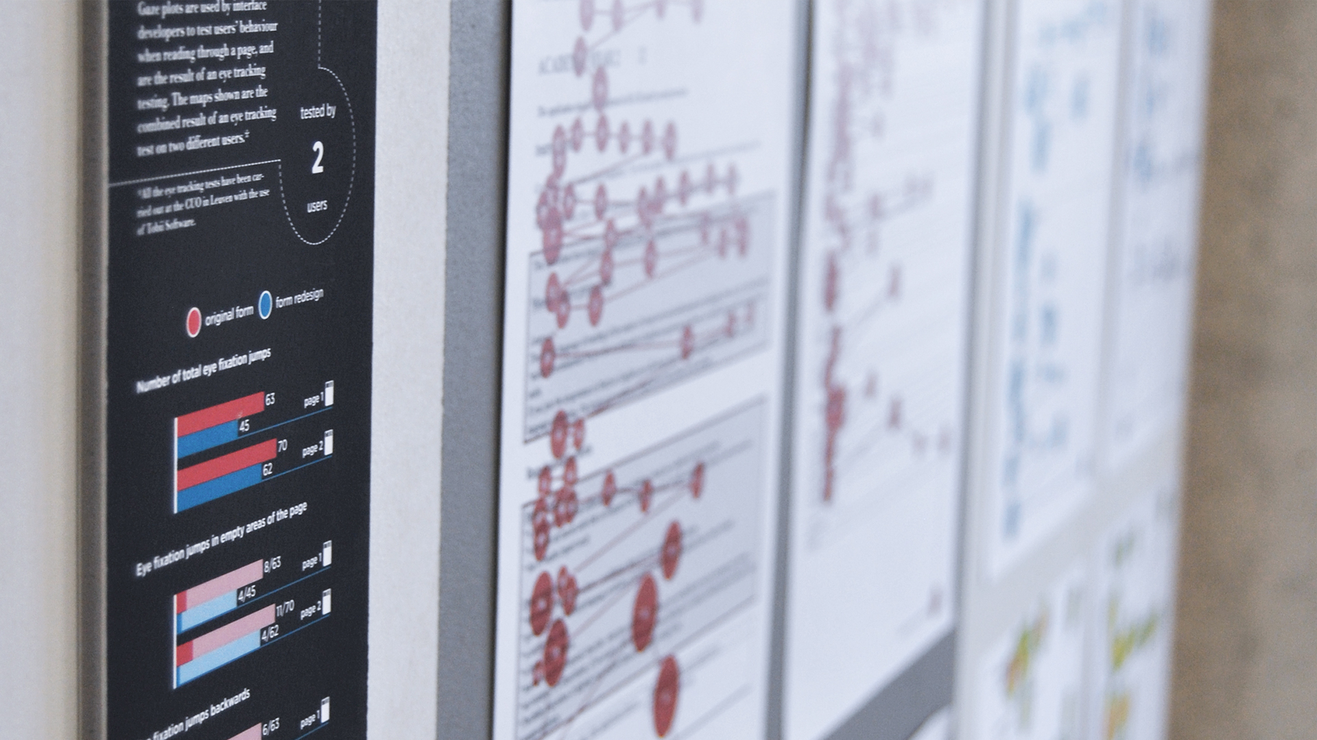
I carried out a comparative analysis of the originals and the re-designs by using a Tobii eye tracking device, which allowed me to map the user’s reading patterns and the main focus points of each form throughout gaze-plot and heat maps, to point out the concrete and effective differences in the users’ experience.
Let’s face it: form design isn’t sexy.
Or, at least, it doesn’t really appeal as the most fun job for a designer.
A form is a document conceived to carry and store information for a large number of purposes: applications, registrations, certificates, invoices, questionnaires, declarations, tickets, are only some of the numerous identifiable categories, the lowest common denominator of which is the fact that they, precisely, transport information.
Forms are an absolute necessity for the kind of industrialized society we live in, which values information and standardization, and must deal with huge amounts of incoming data on a daily basis; they’re the deus ex machina that enables society to function, a means we blindly rely on and, as often happens with something so persistently present, a tangible reality we tend to take completely for granted.
Designing a form is therefore nothing less than designing a wayfinding system for a building: the user should be unconsciously guided in a clear and unmistakable way from the entrance to the exit, he should be put in the condition of being able to find exactly what he is looking for inside the structure, and to move from one point to the other with confidence, and to return to his point of departure if that is what he needs to do.

This project was listed as one of the 100 best projects of 2014 in Belgium by www.znor.be and by the design magazine Kwintessens.